

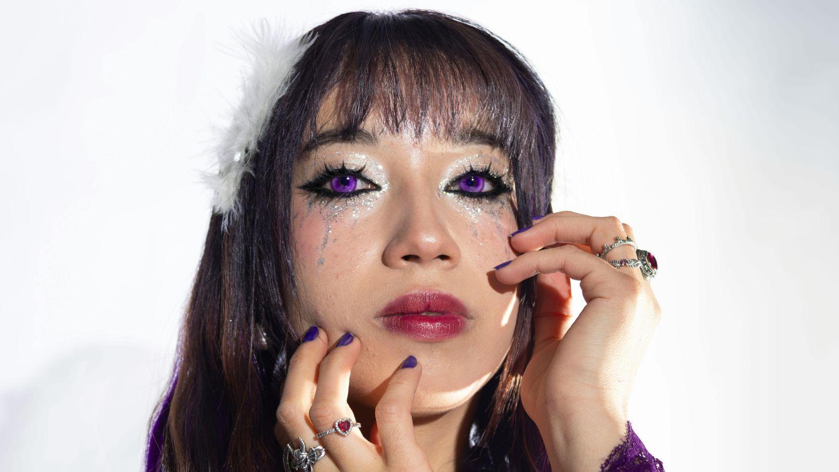
The best coloured contact lenses for a dating app profile picture are shades that create visible contrast against your skin tone without reading as artificial on camera. Warm hazel, soft grey, and honey brown are the most reliable performers across all lighting conditions, delivering natural enhancement that survives smartphone compression. Electric blue and green work well in good light for profiles that want deliberate impact. In every case, a coloured lens reintroduces the iris definition that camera compression strips from natural eye colour.
Dating apps give your face approximately three seconds before a verdict is made, and research consistently shows the eyes are where that verdict begins. Most people treat their profile picture as a casual snapshot when it is actually the highest-stakes portrait they will ever take. The best coloured contact lenses for a dating app profile picture are not about deception. They are about giving the camera what it cannot extract from a natural eye colour on its own.
Three Seconds. That Is All Your Profile Picture Gets
Understanding what happens in that window, neurologically and aesthetically, changes the way you think about every element in the frame, starting with your eyes.
What Attraction Research Actually Says About Eyes in a Portrait
Eye-tracking studies on portrait viewing show that the eyes are fixated within the first 150 milliseconds of seeing a face. On a dating app, where a profile picture is first seen at thumbnail size, that window compresses further. The iris, specifically its colour contrast against the white of the eye and the surrounding skin tone, is what registers in peripheral vision before conscious attention engages. A lens shade that adds definition and contrast to the iris is working at exactly the right level of visual processing, which is why the effect is immediate even when a viewer cannot articulate why a particular profile stopped their scroll.
Why Smartphone Cameras Are Working Against You
Most people take their profile picture on a phone and it is viewed on a phone, meaning it passes through two stages of camera compression. Smartphone sensors flatten tonal range, which is particularly unkind to eye colour. Brown eyes, the most common in the UK, often render as uniformly dark with no visible iris detail. Grey and hazel eyes lose their subtlety entirely and read as a flat, undifferentiated light tone. A coloured contact lens reintroduces the contrast and definition that compression removes, which is why the on-camera result is frequently more impactful than what you see in a mirror.
The Shade Edit: Which Coloured Contact Lenses Actually Work on Camera
Not every lens colour that looks striking in a mirror survives the journey through a phone camera and onto someone else’s screen. These do.
The Understated Performers: Hazel, Honey Brown, and Warm Grey
These are the shades that dating app photographs are made for. Warm hazel adds depth to any eye colour without announcing itself as a lens, which matters because a profile picture that looks effortful loses credibility immediately. Honey brown works with particular power against warm and medium skin tones, where the camera picks up the richness of the shade in natural daylight. Soft grey creates a cool, precise definition that reads sharply indoors without the overexposed flatness that paler shades tend to produce.
The Statement Performers: Blue, Green, and Violet
Electric blue is the most searched lens shade in the UK for a reason. It reads with total clarity on camera in good light, and at thumbnail size it creates an immediate visual signal that registers before the rest of the face is processed. Green performs similarly well against olive and medium skin tones, where the contrast is strong without being jarring. Violet is the most editorial of the three and works best in profiles already projecting a clear visual identity. It needs context to land, but when the rest of the image is doing its job, it lands with conviction.
The Shades to Avoid for a Profile Picture
Very pale shades, icy blues, translucent greys, and near-white lenses, tend to read as flat or unsettling on camera, particularly in the mixed indoor light where most profile pictures are actually taken. Extremely dark lenses close to black reduce visible iris detail rather than adding it, which defeats the purpose of wearing a lens entirely. The goal is always more visible definition, not less.
Lens Shade Performance by Profile Type and Lighting
|
Lens Shade |
Best Profile Context |
Performs In |
Camera Rating |
|
Warm Hazel |
All profiles, universal |
All lighting |
5/5 |
|
Honey Brown |
Warm skin tones, outdoor |
Natural daylight |
5/5 |
|
Soft Grey |
Fair to medium skin |
Indoor and window light |
4/5 |
|
Emerald Green |
Olive and medium skin |
Daylight, ring light |
4/5 |
|
Electric Blue |
Fashion and bold profiles |
Good light essential |
4/5 |
|
Deep Violet |
Editorial, evening profiles |
Controlled light only |
3/5 |
|
Icy and Pale Shades |
Avoid for profile pictures |
Flat light only |
2/5 |
The five-star performers are universally flattering across lighting conditions and profile contexts. As enhancement level increases, so does the lighting dependency. Bold shades need quality, controlled light to perform, while subtle enhancement shades deliver consistently regardless of environment.
For UK wearers who want to work through the options before committing, the full range of coloured contact lenses at Bellalense, available in both prescription and plano across every shade in the table above, is the most practical starting point.
Matching Your Lens to Your Face: The Variables That Actually Matter
Shade selection is never universal. Skin tone, natural eye colour, and lens opacity together determine whether the result looks intentional or off.
Opacity Is the Decision Most People Skip
Opacity is the difference between a lens that reads clearly on camera and one that disappears against the natural iris. Dark eyes require significantly higher opacity for a shade to show at all, let alone register through camera compression. Light eyes can work with lower opacity for a natural enhancement effect but risk the shade vanishing under bright light or flash. Checking a lens’s listed opacity level before buying is the single most practical step most profile picture planners overlook, and the most common reason a lens shade looks nothing like its product image in real life.
Skin Tone, Contrast, and the Camera Triangle
The camera reads contrast, not colour in isolation. Warm lens shades, hazels, honey browns, and ambers, create their strongest effect against fair to medium skin tones where the warmth in the lens is amplified by cooler undertones in the skin. Cool shades, greys and blues, work with most power against warmer, deeper complexions. Green operates differently from both: it creates strong contrast against olive and warm medium skin tones and is one of the most reliably photogenic choices across a wide range of people.
How to Actually Take the Photo: The Part Nobody Talks About
A well-chosen lens shade in a badly lit photograph is still a badly lit photograph. The shooting environment determines whether the lens does its job or disappears entirely.
The Light That Makes Eyes Look Extraordinary
North-facing window light on an overcast day is as close to a universal flattering light source as exists without spending money on equipment. It eliminates harsh shadows across the eyes, renders skin tone accurately, and gives lens colours their truest representation on camera. Ring lights are effective indoors but produce a circular catchlight in the iris that reads as slightly artificial at close range. Golden hour outdoor light, the hour before sunset, is the most forgiving natural option for any lens shade and adds warmth that benefits nearly every complexion.
Framing, Distance, and Making the Eyes the Anchor
The eyes should sit in the upper third of the frame and the shot taken from roughly eye level or fractionally above. A downward angle flattens facial features and reduces the visible area of the iris. A chest-to-head crop keeps the face as the subject without the claustrophobia of an extreme close-up. A plain or naturally blurred background removes visual competition from the face entirely, directing the viewer’s attention straight to the eyes and the lens shade within them.
One Trial Wear Before the Shoot
Inserting a new lens for the first time during a photo session is not the best approach. Eyes need thirty minutes to an hour to settle after insertion, and any redness or discomfort will show in the final image regardless of how good the light is. A short trial wear the day before confirms the shade reads as expected on camera and removes the self-consciousness of seeing yourself in a new colour mid-shoot.
Conclusion
The best coloured contact lenses for a dating app profile picture are not a shortcut. They are a considered decision about how you want to be seen before a conversation has even started. The right shade, in the right light, in a properly framed image, does not make you look like someone else. It makes you look like the version of yourself that a camera has always struggled to capture.